Let's bike and fly
Pegasus bicycles have been around since 1984. It is the private label of ZEG, Europe’s largest bicycle purchasing cooperative, with over 1,100 affiliated specialist retailers. For more than forty years, Pegasus has built a reputation for offering high-quality city, trekking, and e-bikes at an attractive price-performance ratio. The task was to reposition Pegasus for a market that is booming while undergoing significant change.
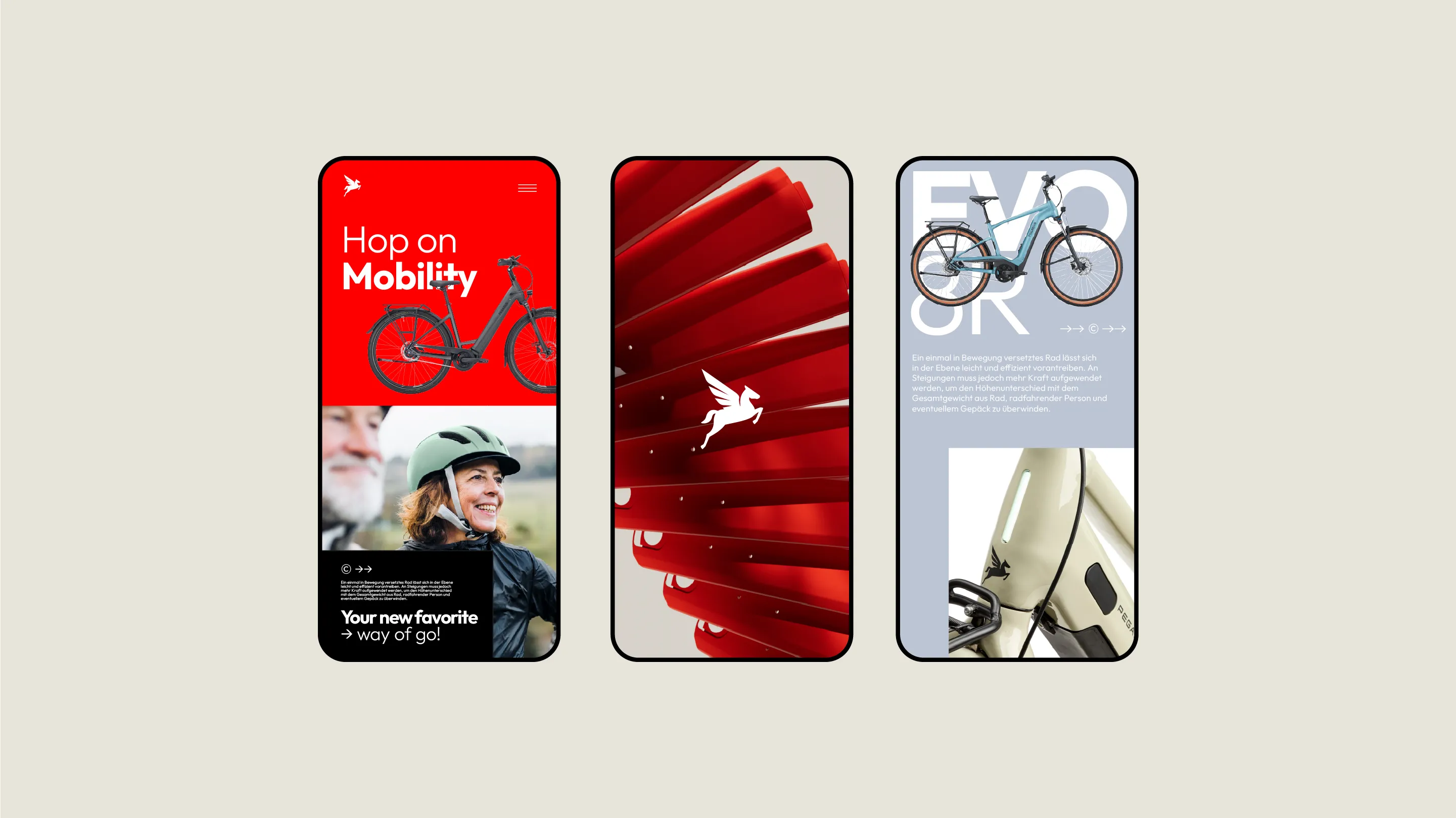
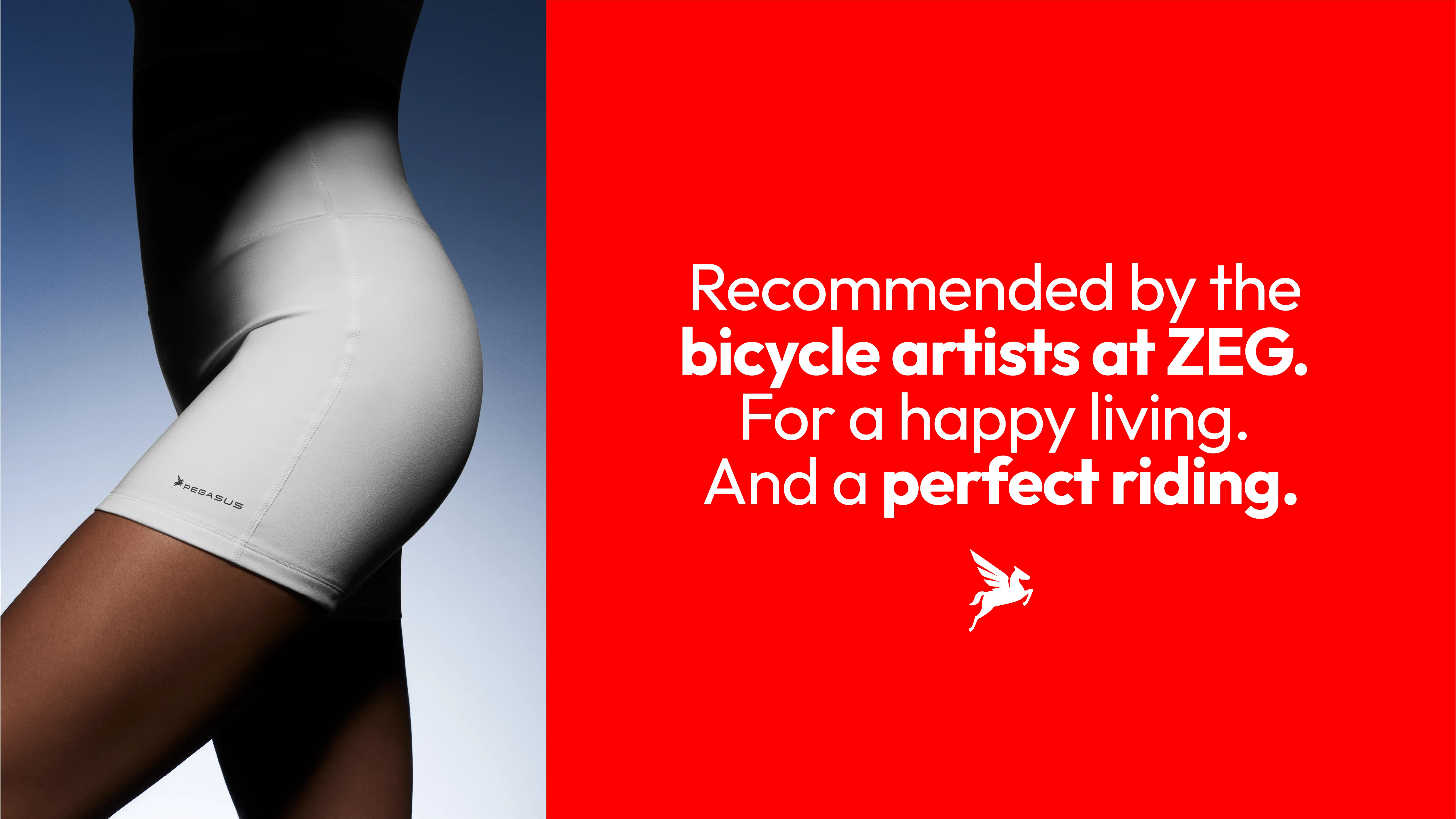
The goal was not to create hipster branding for vintage road bike enthusiasts, but to develop a design approach that reflects the brand’s identity and broad target audience. One that takes into account the diversity of the model range and also appeals to children and seniors.
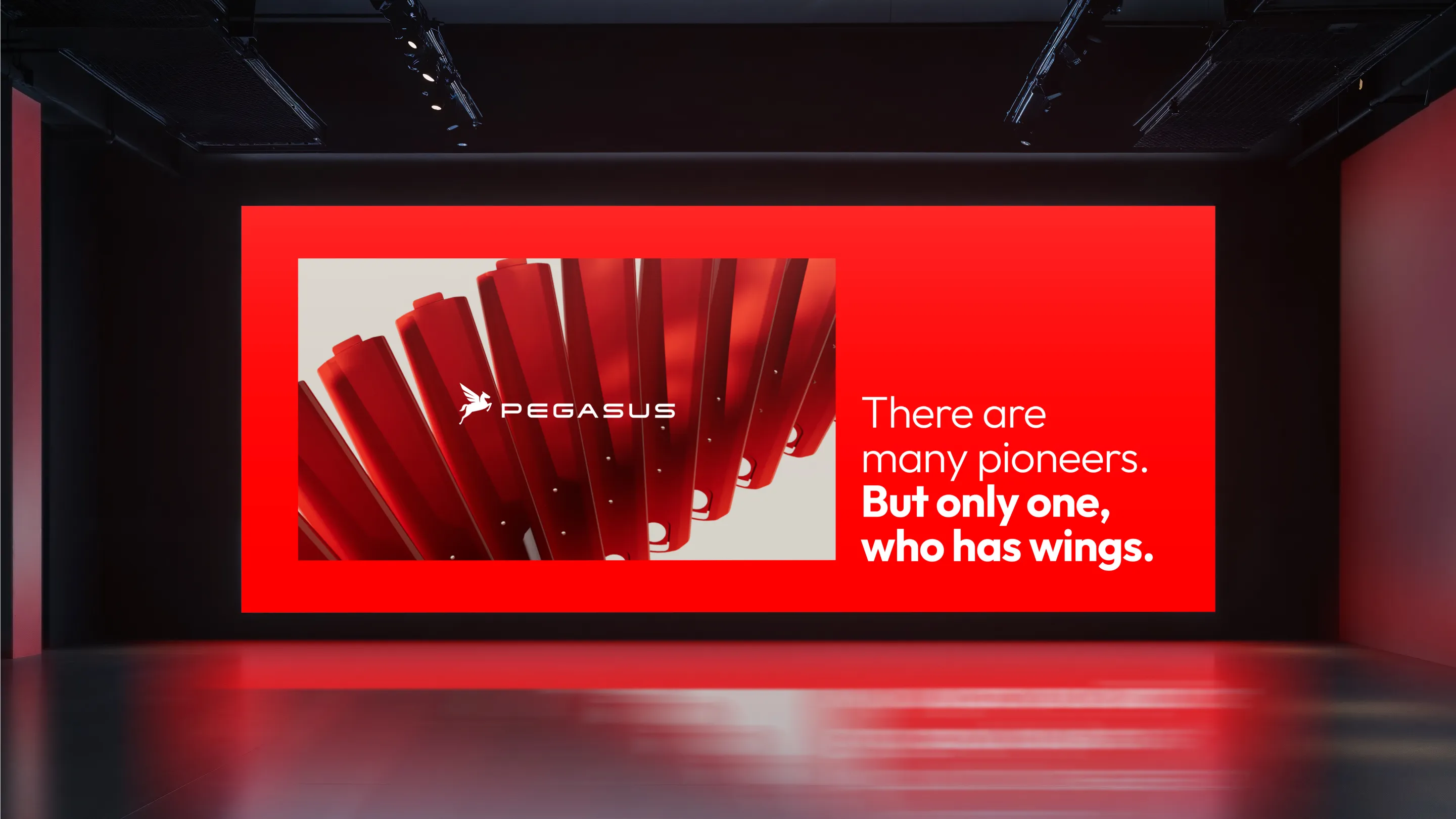
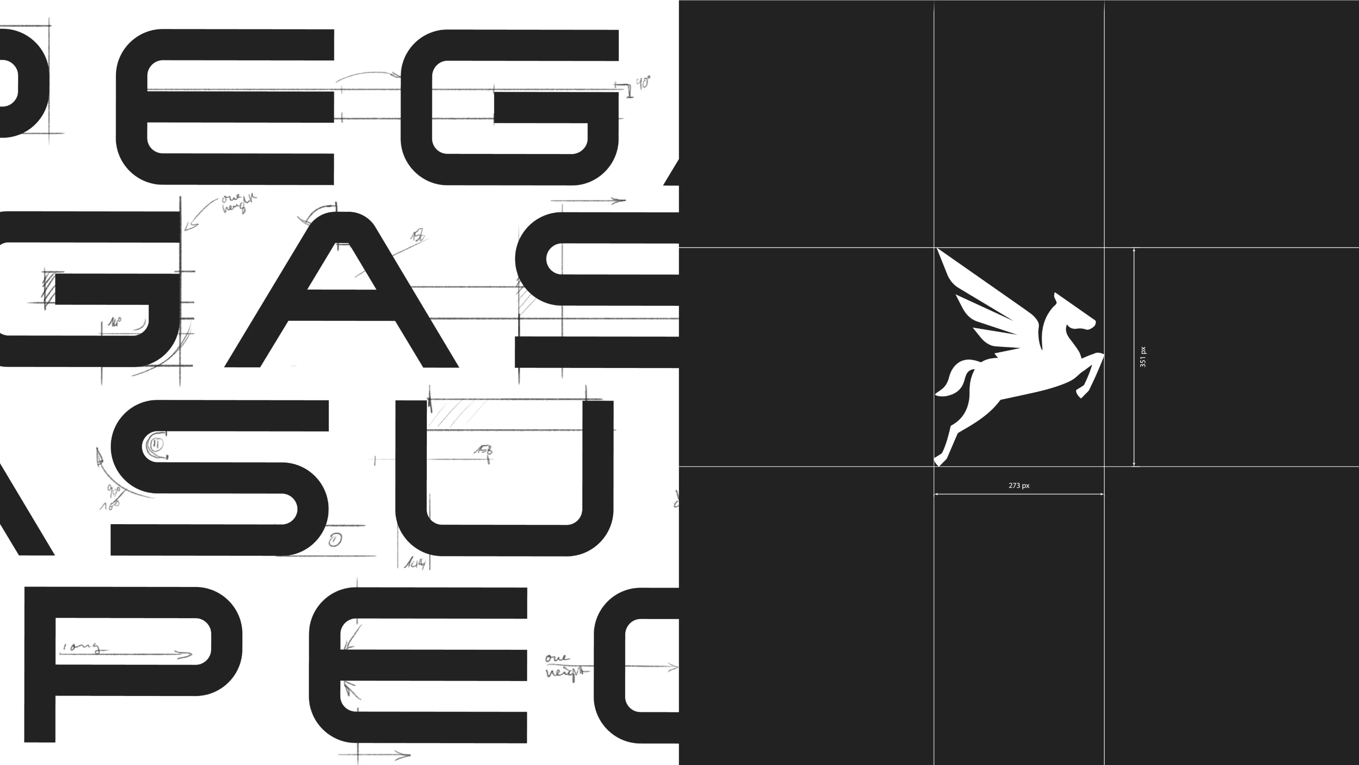
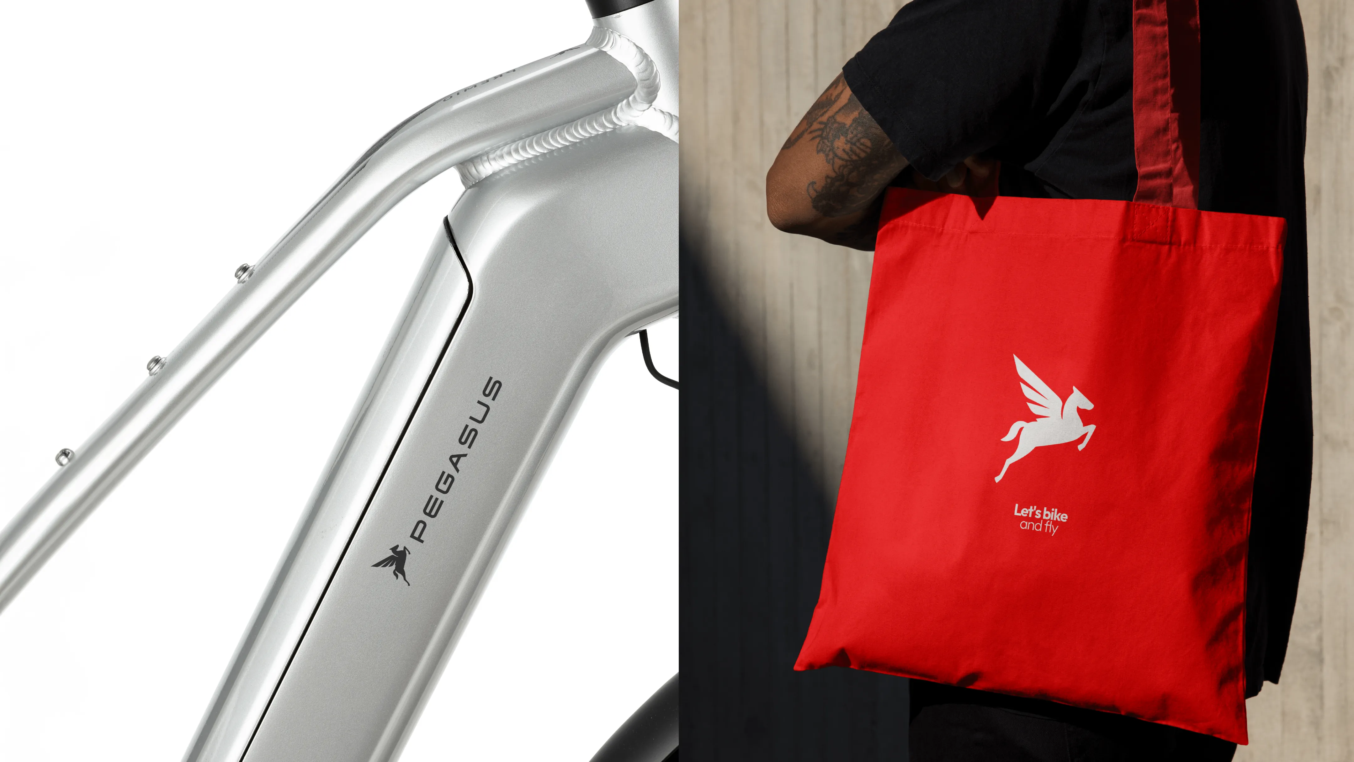
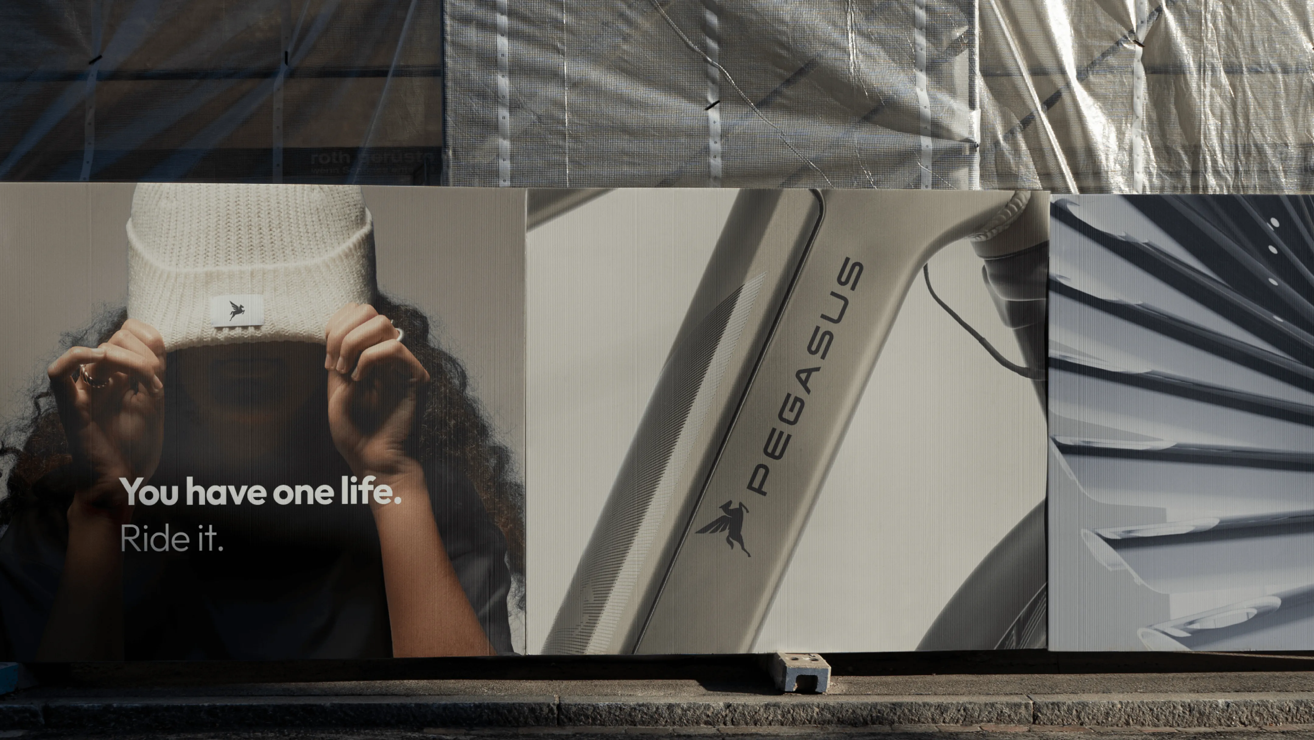
At the heart of the rebranding is the newly designed Pegasus: with its proudly raised wings, it conveys a clear sense of energy, freedom, and fun. We also refined all other brand elements – from the clear and memorable color palette to the imagery and a technical typeface that enhances the overall impression of quality.
Completely new are the CGI visuals: components from Pegasus bicycles form abstract wings and become distinctive elements for brand communication.

Sven
Executive Creative Director

Magdalena
Director Consulting

Next up
Giving triathlon four colors and new coolness
TBL